
Pathfinder Pro
Making hiking experience safer and more seamless

Overview
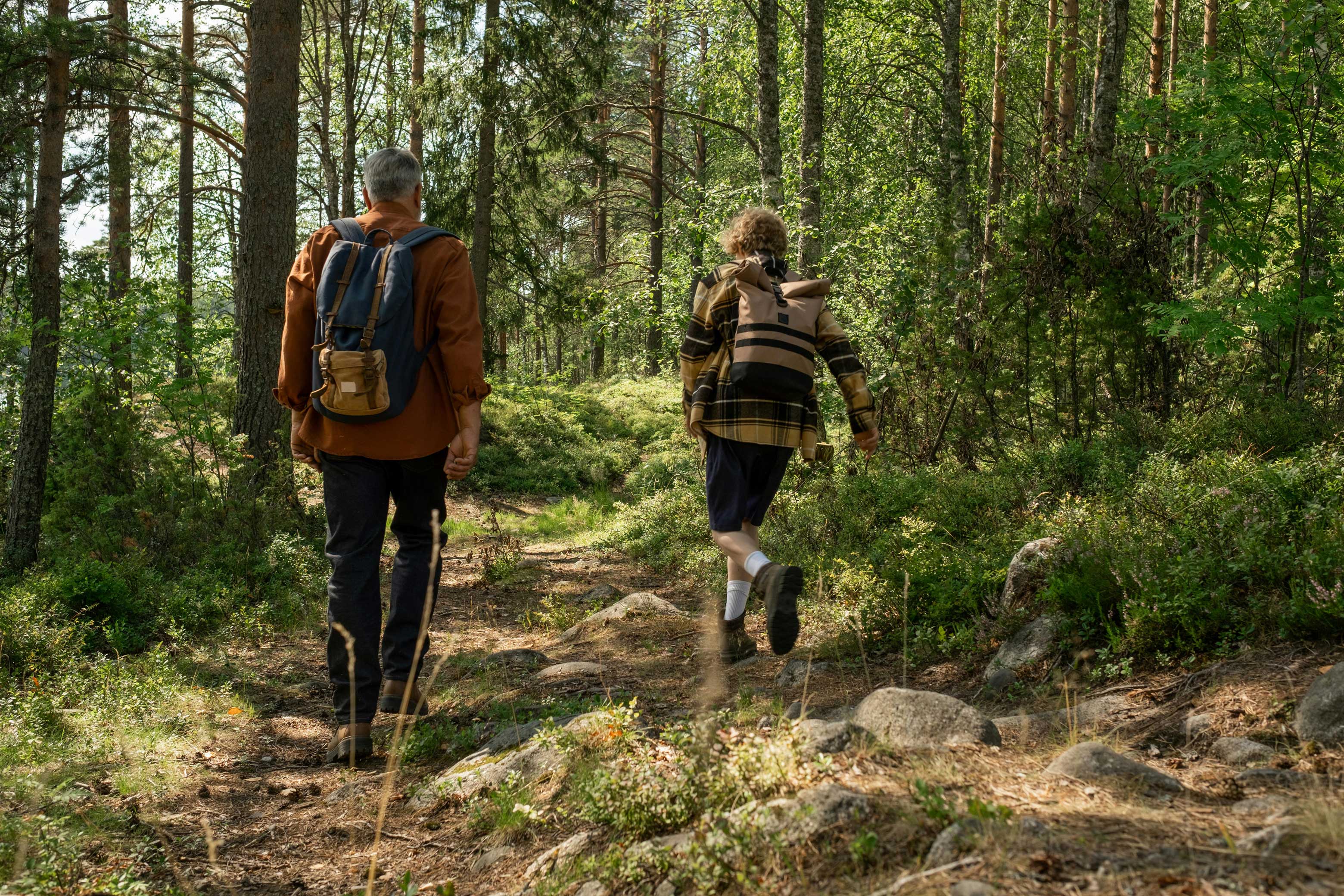
Pathfinder Pro is an academic concept app for wearables inspired by a real hiking experience. I and my group of friends struggled to juggle multiple apps for maps, weather, and safety when we were on a trip, so the idea for an all-in-one hiking companion was born.
This redesigned version was fully created by me, with many thanks to my old teammates for the initial concept ;)
Problem
For many of us, a bit of challenge is what makes hiking enjoyable. The right balance between adventure and fun depends on each person’s comfort with risk, but at the end of the day, we all want a successful hike and a safe return home.
Hiking should feel adventurous - not like managing five different apps just to stay safe and on track. That led to one core question: How can I help hikers navigate their adventures more seamlessly?
Research
To validate the problem space and uncover real on-trail pain points, an interview was conducted with hikers and outdoor enthusiasts. I sorted all the answers and categorized them to find commonalities.
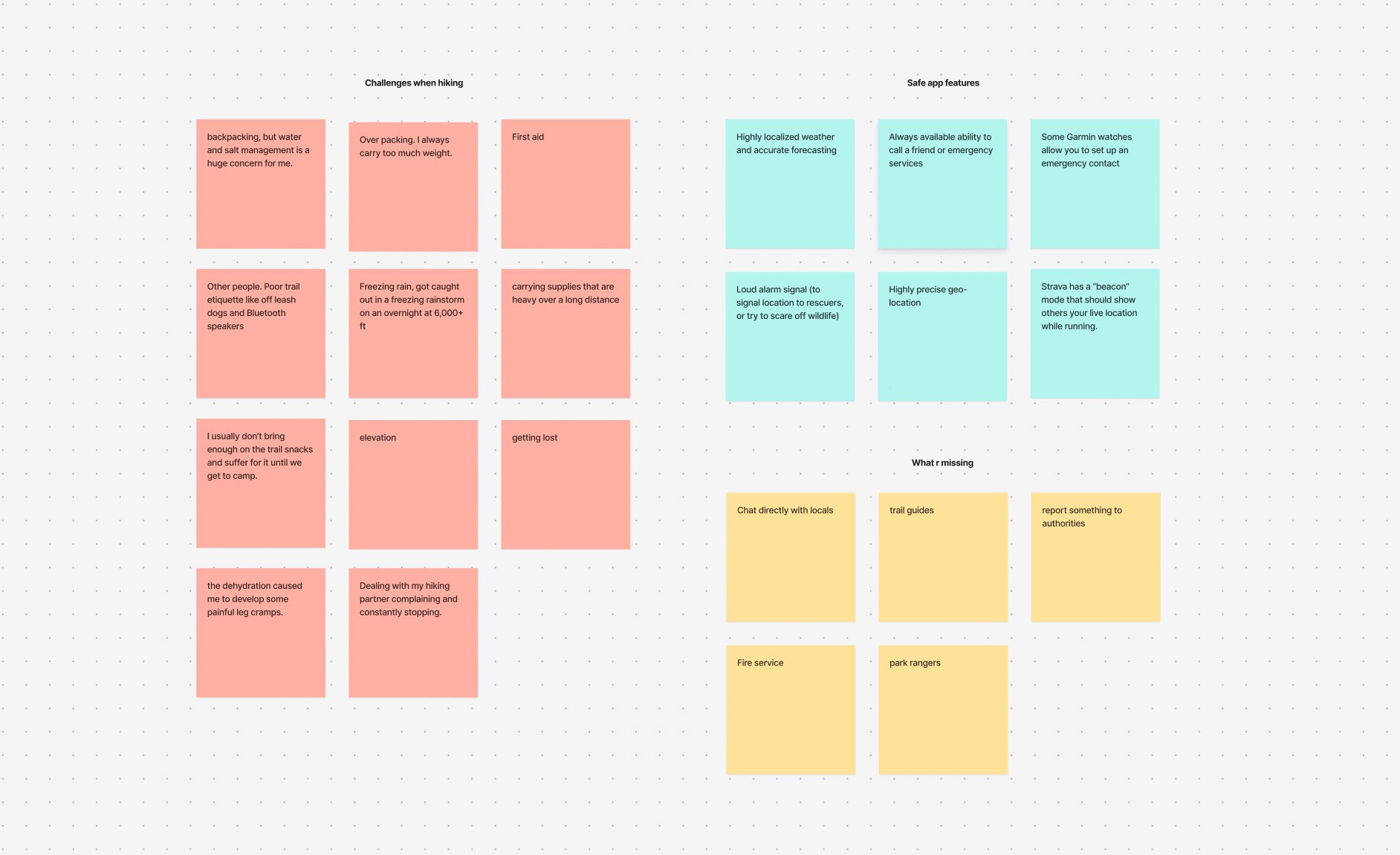
3 interview questions were: 1) What challenges do you face when hiking or camping in remote areas? 2) What features would make you feel safer during outdoor adventures? 3) What do you think is missing from existing navigation or safety apps?
Key findings:
Navigation anxiety
Many interviewees expressed a persistent fear of losing the trail or misjudging their route, especially in remote areas with poor signage or limited visibility.
Physical strain and preparedness
Most hikers struggle with water, snacks, and heavy packs, leading to dehydration, cramps, and fatigue.
Environmental risks
Harsh weather and environmental conditions (freezing rain, high elevation,…) make trips riskier.
Communication features
Poor trail etiquette also make trips more stressful. Therefore, must‑have features should include reliable ways to communicate with other hikers, contact friends or emergency services.
End-to-end hiking process
Researching the hiking process was essential to understand where, when, and how hikers actually need information, so the app’s information architecture could mirror their real journey. Speaking from my own experience and other hikers, the process of a successful hike is:
Trip planning -> Safety & Navigation prep -> Packing & gear check -> On‑trail navigation and monitoring -> Communication and incident response -> Post‑hike review.
Ideation
Sitemap
Therefore, I created he sitemap that organizes the app into five main pages: Home, Navigation, Activity, Community, and User Profile. Each section focuses on a core part of the experience: discovering trails, accessing live navigation tools, tracking personal progress, connecting with other hikers, and managing devices and settings. This structure keeps the app intuitive, clear, and easy to explore at any stage of the journey.

Pathfinder Pro information hierachy
Style guidelines
I also created a simple cohesive style guide to ensure the app feels clear, consistent, and trustworthy across every screen.
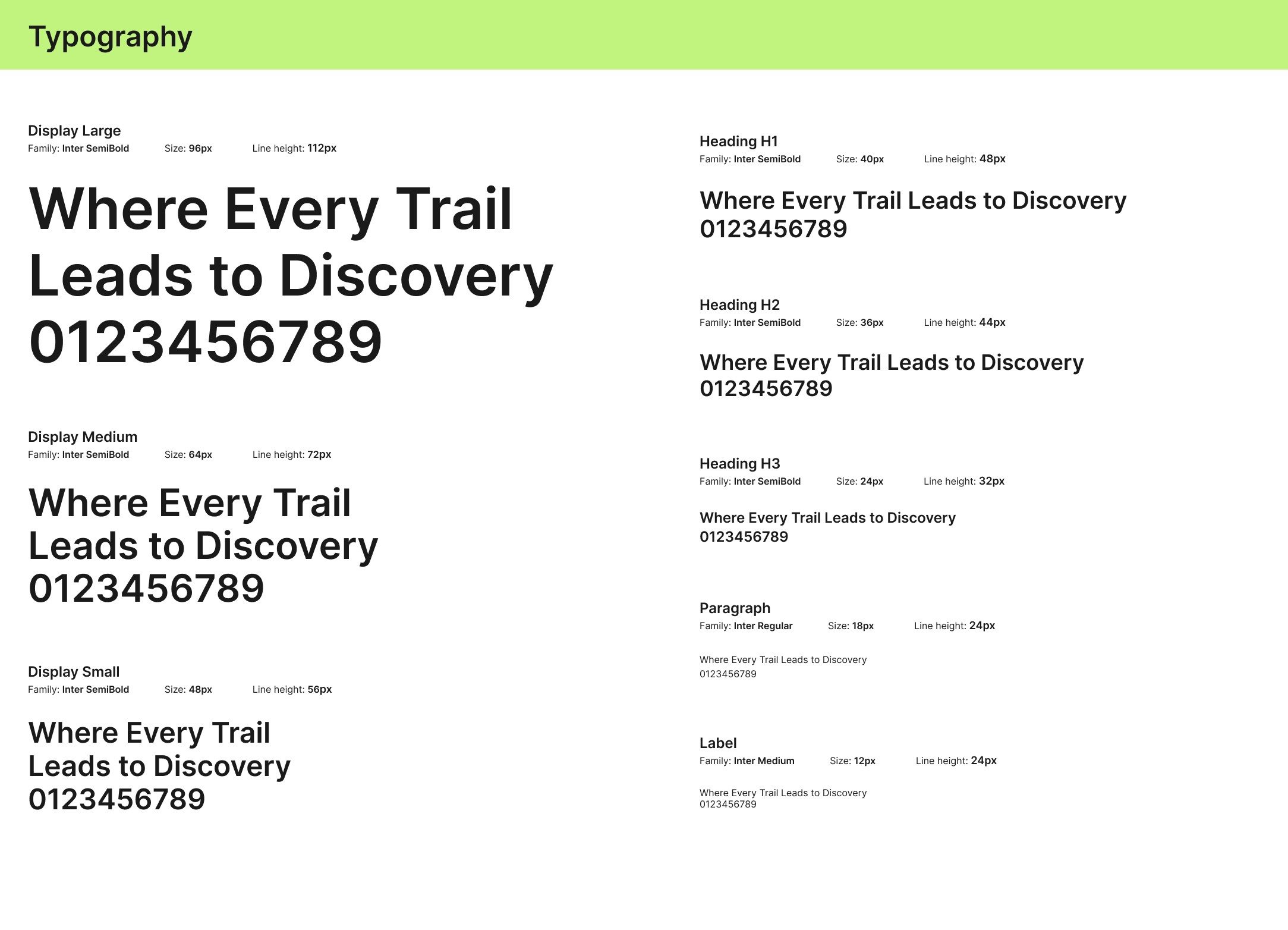
Display is used to make the brand feel bold, adventurous, and memorable while still keeping the interface easy to scan.
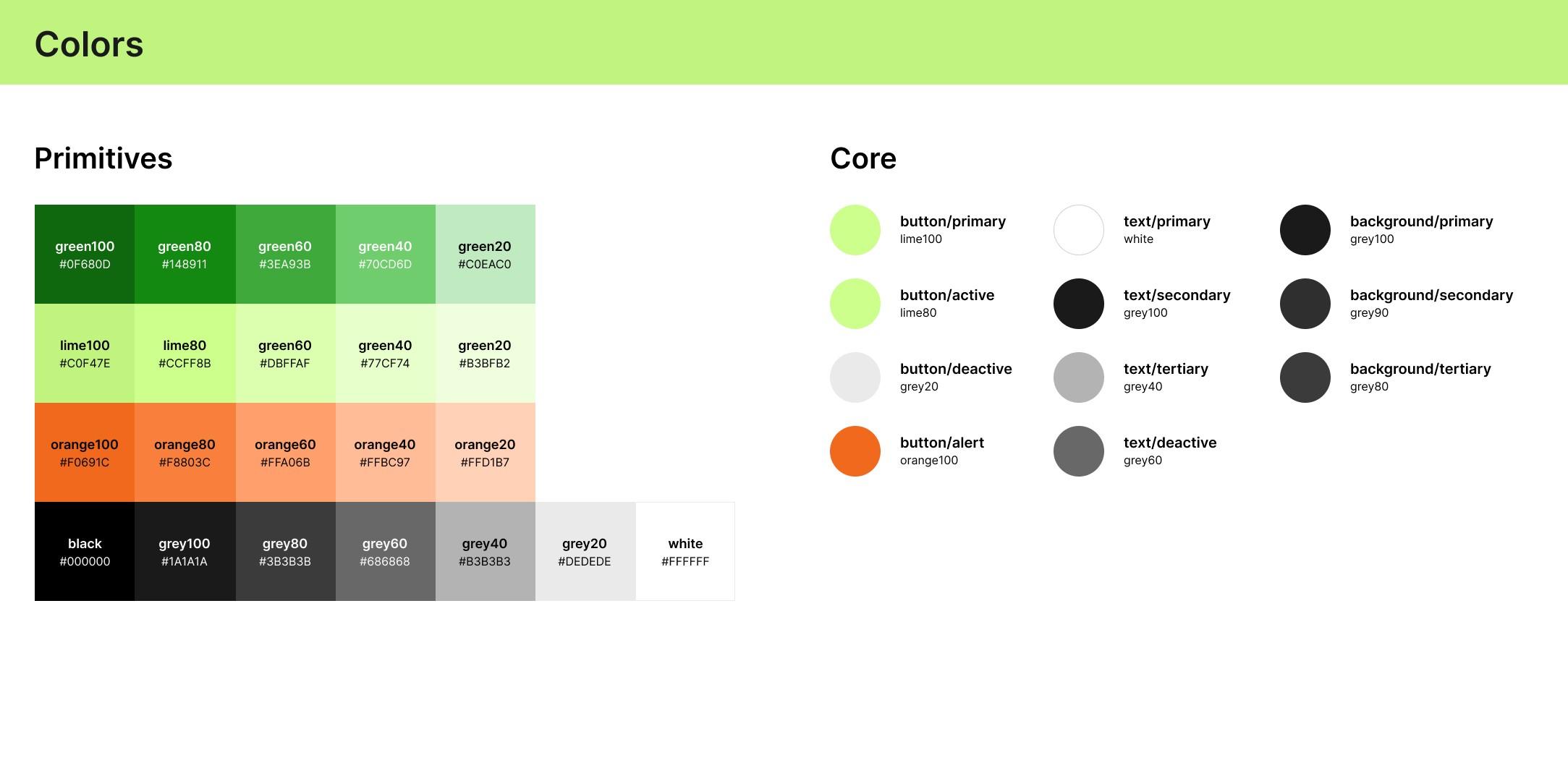
The green and lime tones connect naturally to hiking, nature, trails, and fresh air, so they instantly support the outdoor theme. The orange adds a strong safety signal, which makes it a good choice for alerts, warnings, and emergency states.
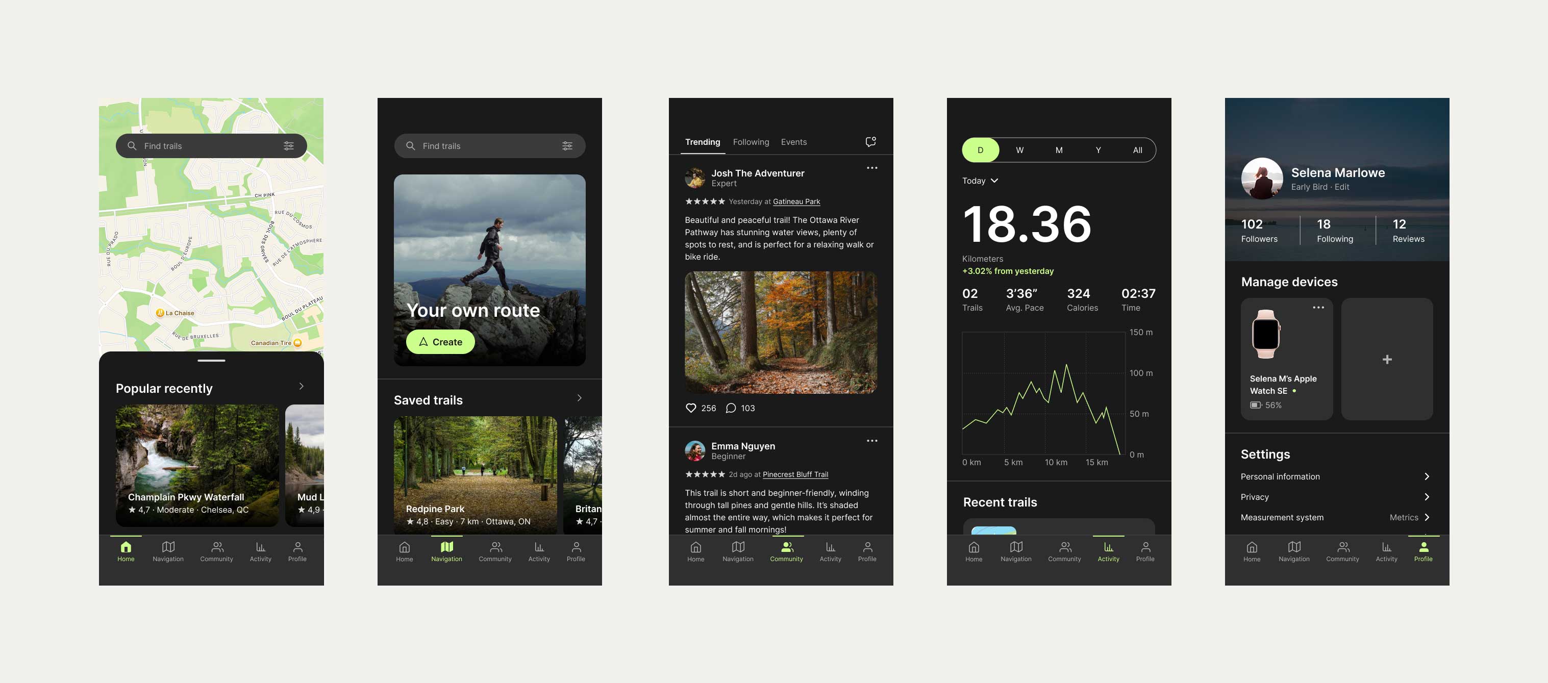
Solution
Navigation overview
The navigation bar includes five main screens, structured around the app’s user flow: Home for recommended trails, Navigation for route planning and offline maps, Community for events and connecting with fellow hikers, Activity for tracking progress, and Profile for personal settings.
Detailed trails information
Online & offline maps for navigation
Communicating with others
Activity summary
Personal settings
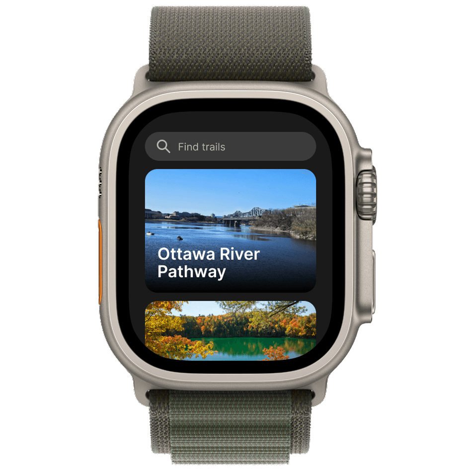
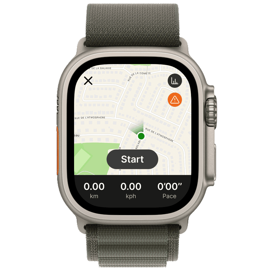
Wearables concept
Next steps
Due to time constraints, I wasn’t able to refine every function in this concept app. However, these are the improvements I plan to make in the future:
Add "Trail preview" icon to every trail.
Adjust the wayfinding color to indicate when hikers are entering high-risk terrain.
Create a check-list of necessary tools for the trail.
Revamp the Settings page to display user reviews first, with all settings placed under a smaller secondary button.
Add micro-animations to improve component interactions and overall user experience.